Don’t you love computer gremlins or the vagaries of the Internet? I thought I had published this blog first thing Friday morning.
“Don’t you have a new blog?” Arnie asks me as I am headed out to lunch today with a friend for my Birthday.
“Yes, what do you mean?”
“Well it still says the 17th!” Ugh! Arghhh!
So, my apologies to all of you, and I shall make sure it goes through this time!
We’ve now taken through you all the other Lightroom modules. The last one is the Web module, the easiest one of the five. Again, we are only giving an overview, since there are great tutorials, books, and of course, our workshops to help you, but this may give you a few hints to help you along.
Many of the principles you have learned in the previous installments apply here, so this blog will be the shortest one in the series. You’ve already noticed similarities amongst the Lightroom modules. We have shown you how to navigate around the left and right panels, how to create your own templates, and how to update them. Again, we urge you to open your own copy of Lightroom to see more details than can be shown in the screen shots here.
The Lightroom Web module is an extremely powerful tool. It has numerous layouts and presentations that you can tweak to your satisfaction, from Flash or HTML slide shows, to interactive displays where you click on a thumbnail to see the larger version of an image, to an informal Picks from My Trip view.
Hint
In your User templates, select and continue to use the same basic colors that you use on your website or special page. This will reinforce your look.
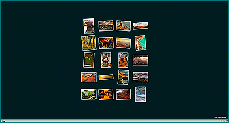
Below are a couple of examples of web presentations I created from some basic Lightroom templates that I tweaked slightly to make them ours. Remember, I have done nothing other than my basic image adjustments. I have done no sharpening, no resizing, no borders, etc. Lightroom does that all for you! You will see that they carry the same color theme you saw in our slideshow presentations on the website.

Airtight PostcardViewer
4-Column Layout

Airtight PostcardViewer
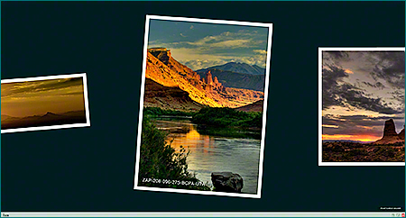
Enlarged Image View with File Name on Image
For those who are not familiar with flash, Lightroom makes it easy to create these presentations. For the more sophisticated, you can integrate the code into your own website layout.
Hint
I always use the Preview in Browser button at the bottom of the panel. That way, you can make sure that you have gotten exactly what you want before Exporting (publishing) it through the button at the bottom of the right panel.
Hopefully this series of articles has shown you a few hints, given you some ideas of ways you can tweak your photos, shown you how to create your own templates, and in short, made Lightroom a little easier to use.
Next Week
Who knows what next week will bring? It rather depends upon what my fingers on the keyboard and whatever’s in my head take me, and of course, you!
Comments from you are always encouraged and welcomed. If you do not see the “Leave a Reply” box below this article, it’s probably because you are still on the Home page. Just click on the article title at the top and the “leave a Reply” box will appear down at the bottom. Even if you choose not to do that, please share this blog and our website with your friends and relatives who love photography.
Meanwhile, check out our Barefoot Contessa Photo Adventures website, and if you are considering joining us, do as others have already done … make your room reservations. You can always cancel later if necessary! We have added a Wish List section to our Calendar. Some of our alumni have expressed interested in our putting together workshops both in Spain and at Grand Tetons and Yellowstone National Parks. If we get enough interest, we will add one or both to our schedule.
Keep posting stuff like this, as it is really useful. Thx. additionally added your RSS feeds.
Glad you found it helpful! TBC
Thanks for the great information. I have it bookmarked and will be back.
Have you ever considered adding more videos to your blog posts to keep the readers more entertained? I mean I just read through the entire article of yours and it was quite good but since I’m more of a visual learner,I found that to be more helpful well let me know how it turns out. Keep up the great works guys I’ve added you guys to my blogroll. This is a great article thanks for sharing this informative information.. I will visit your blog regularly for some latest post.
Michiko,
Thanks for writing. It’s a great idea, and we’ve tried to figure out how to do it. So many of my blogs are done from on the road. For example, I’m writiing this from Belize where we’re holding our first workshop of the season.
The blog series on Lightroom was done as a way to give people an overview of and introduction to the program, since we use it as a teaching tool in our workshops. Once people join us, we show them first hand (even better than video) how to do these things.
Take care, and I’m glad you found it useful,
TBC