MooseCat (silly kitty) is preparing for our departure, training (he thinks) Sara and Julio to do a good job. We don’t have the heart to tell him that Sara and Julio will really rule the roost!
We head to Maine first, then spend time in New Hampshire to decompress, see family and friends, and hopefully enjoy some less-oppressive weather. Then, we go to the Southwest, seeing family on the way out and back, before returning to New England for the final workshop of this trip.
The header above was made last year during the Arches & Canyonlands National Parks photo workshop, and we still have a few spots left, so if you’re interested, sign up!
Our exhibition, Tropical Impressions from Belize, was taken down last night. We have been getting nothing but rave reviews, so we feel very pleased.
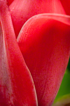
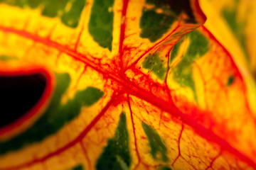
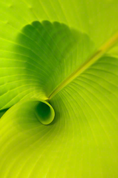
The images you see here are from the show. Many who could not make it to the exhibition because of distance have asked when they can see it. Are we going to do a book?
Those are things that we are considering, as we have received interest from other venues for hanging our work. That will take time. There is a lot that goes into finding a good venue for an exhibition. It is one thing to be asked to show one’s work. It is another thing to make sure it is the right match between gallery and artist in terms of space, philosophy, audience, and timing.
Earlier this week, Arnie and I were the judges for an Open Print Competition at a large camera club. “Open print” indicates that the subject is not limited; one can submit anything one wants, be it color, duotone, or black and white.
 This is the third time we have been invited to this club. We have done a presentation on what goes into good composition and another one on creativity. It has been fun, and they are an appreciative audience.
There was a good mix of photographs, and some were really quite good and imaginative. We told the club that we look for aesthetics and passion first, then the technical aspects second. We were told that matting does not count against those who submitted.
I could not, however, not comment on the fact that people need to pay attention to presentation. There is no excuse for dirty mats (use an eraser), poor cuts (a ruler works), and sloppy presentation (pay attention to detail). It simply indicates to the viewer that the artist does not respect his or her work.
The making of the image in camera is only the first step in preparing an image for display.
Some people can get whatever they want/need for photography; others are working with a shoe-string budget. What follows has nothing to do with budget. It has to do with being careful and taking the time to make sure thing are right.
There were mats that were sloppily cut. A sharp blade in an Exacto-type knife and a straight edge will ensure that the cuts are straight. Paying attention to the size of the mat in relation to the image itself is also important. And please, please, please, if you are going to leave a white edge between the image and mat edge, mount it straight!
We were really pleased to see almost all white/off-white mats, with a couple of black ones, and fortunately, only one that was colored. I can’t ever recall seeing colored mats around photographs in any museum or high-end gallery. There is a reason!
OK, on to the the technical aspects …
 We saw prints with dust motes that had not been removed. Even the cheapest, freebie imaging program has some sort of clone/heal tool. Learn to use it.
There were distracting elements right on the edge of the print. Either clone or crop those elements out, or in some cases, burn them down. (For those who don’t know, burn is a term that means to selectively darken certain areas of a photograph, just as dodge means to selectively lighten.)
As we say in our workshops, just because one’s camera is a 2:3 or 4:5 or 2:2 aspect ratio (relationship between the width and height), it doesn’t mean that your image wants to be that ratio. Add to that is the fact that most viewfinders do not show you 100% of what will be in the image. So, crop as much as you dare in camera, but use the Crap Croppers (our term) in post-processing to remove those edges, if need be, and that fourth side if you want to change the aspect ratio.
Some photographs had areas that were too hot, detracting from the overall feeling of the photograph. A light touch in burning can take care of things like this.
There were some foregrounds that were brighter than the subject, so that the eye went to the foreground rather than the subject. Again, simple burning can take care of this.
In one case, the photographer dodged the area around a flower, making it very effectively stand out against a lighter background. Burning is not always the appropriate solution.
Some subjects showed an appropriate range of values (lights to darks), while others had shadows that were blocked up and could have easily been opened up a tad. There were prints that could have used more contrast or blacks, as they looked washed out when that was not the intention of the photographer.
 Just as photographers went into the chemical dark room some years ago, now they must go into the digital darkroom to bring out the best in their photographs.
Then, there are the aesthetics, things we talk about all the time in our workshops …
In composing an image, are you involved? When photographing people, is your subject involved? Is your depth of field appropriate for your subject matter? Have you avoided those potential hazards? What about converging lines? Is the background appropriate for the subject? What about the light? Is it dramatic or flat? Does the viewer’s eye go to the subject or is it conflicted because of poor composition? Does the image evoke a response in the viewer?
We saw many wonderful images at the camera club. Some didn’t get an award, however, because not enough attention was paid in the post-processing and printing process. Those that took the prizes and honorable mentions were carefully prepared.
A lot of time went into the preparation of these four images, five if you count the banner at the top, just as it did when we were dealing with chemical labs. Remember, the making of the image in camera is only the beginning.
We always love to get comments.
We also hope you will LIKE this blog (just above the blog title above) and SHARE it (below) with those interested in photography and travel along with the following:
Thanks, Margo, for the great article. When I popped over here from LinkedIn to read your article, as always, I was immediately distracted by the knock-’em-down photo header! Although I am a painter, not a photographer, I do love your work (mountains really speak to me!) and learn from your photography advice. Thanks again.
You know, principles of composition apply to any medium, painting, drawing, sculpture, photography, etc. Design is design, and values are values.
I’m so glad to hear that you love our latest header. I change them periodically, depending upon my mood and how much time I have to do it!
Take care, and thanks for writing. (we always love it when you rate our blogs, too!
TBC
Hi!
I was there last Wednesday at the open print competition. And wanted to let you know that I really enjoyed hearing the critques. It made me look at my photographs in a different way. Hey….I might even get me a crapcropper 😉
Petra,
It was a joy and an honor for us to judge the competition. We are so glad that the critiques were helpful, if your comments and those we heard from many others are any indication. Those comments make us feel good about what we do. We always want to encourage people. At the same time, we also want to push everyone to do better.
As to those Crap Croppers, they are an integral part of our workshops. We have two sets, one for Arnie and one for me. They are easy to make, but then, once you get the images onto the computer, you can do that with your imaging program.
Take care, and thanks for writing,
TBC
Margo:
Excellent article! I have had the honor of jurying several camera club competitions and have faced exactly what you noted, with the addition of two other problems being the triangles in the corner that lead the eye right out of the image and the “image with a history.” This is the one that the photographer needs to explain to you because of the difficulties encountered in its capture or how the person felt when they captured it. Of course, neither of those attributes are evident in the image itself. Generally, if you have to explain an image it has already failed. Thanks for putting it all in one place. Dave
Dave,
I’m glad you liked it. The triangles are certainly an element, but I didn’t want to get too specific. I figured I covered that in some of the sections, but it is, as you say, worth noting.
Your point about not having to explain your photograph is a good one. In these types of competitions, at least in this area, the photographers are not given the opportunity of explaining their work. Instead, in some cases, we noted that we were not sure what attracted to the scene. Where did they want our eyes to go?
Thanks, once again, for weighing in. It really helps to not write in a vaccuum. The stats show that lots of people read our blogs daily, but one would never know by the numbers (or lack thereof) of comments.
Take care,
TBC