Over the weekend, I took time off from our regular work to do some black-and-white images.
Some people see in color, and some people see in black and white. Arnie and I see in both.
What it really is all about is seeing values. You know, that range from lights to darks. As did Arnie, I started out in black and white, but for me, it was with my trusty Brownie Hawkeye. Some of those images that I made when I was eight stand the test of time today. But that’s not the point of this blog except that I have been around black and white for a very long time. Even when I was shooting mostly color, I was also admiring the black-and-white photography of Henri Cartier-Bresson, Edward Curtis, J. Walker Evans, and a plethora of others.
 There were some images from Death Valley that I knew at the time would make good black and whites.
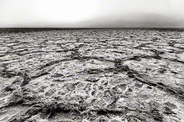
As those of you know who follow this blog, we ran into the sand/dust storm of all storms in Death Valley last month. Locals hadn’t seen anything like it in decades. While it was challenging to keep the camera safe, it was also great for photographs. The one above was made when the storm was beginning. The valley floor was still clear, but the mountains and hills were being obscured as the storm got lower and lower.
I didn’t want to lose that feeling of the storm lurking above the desert floor. I had already processed my color image, but after I took it over into nik Silver Efex Pro*, I brought it back into Lightroom to complete my tweaking. In this case, I wished to maintain the subtle outline of the mountains across the desert floor, so I darkened the exposure in that upper part of the image and brought out a little more detail in the salt ridges in the foreground to contrast with the storm.
Very often, I vignette by darkening the edges to draw the eye into my subject, but in this case, I actually lightened the edges a tad to lessen the impact of the salt lines as they drifted out of the frame.
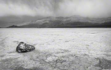
 In the next image, there were signs of the storm in the distance. The “scooty” rock in its setting was my subject, which meant that I could not allow the mountains to intrude too much.
Again, I took my image over into nik for my base black-and-white conversion, did my normal tweaks there, then brought the photograph back into Lightroom where I not only darkened the sky and mountains, but reduced their contrast and sharpness. Where the previous settings worked in color, I thought they needed further tweaking for the black-and-white image.
Then, some subtle painting in the foreground produced the effect I wanted. In this case, I did darken the edges somewhat.
I never use the vignette tool in Lightroom, preferring to do it by hand following the nature contours of the image.
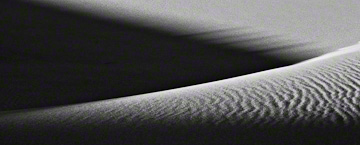
 Part of shooting in Death Valley ultimately involves visiting the dunes. We were no exception.
For the third image from this area that I processed in black and white, I chose a composition that relied on simple-but-strong, geometric shapes that I thought worked really well.
After a conversion in nik, I played with the tone curves rather than adding contrast. In this instance, I thought that contrast was too harsh. After all, there is a softness to the sand. Then I accented the texture in a couple of areas.
I kept the effect simple to match the simplicity of the composition.
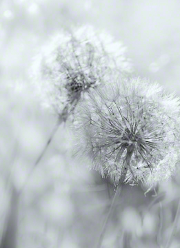
 It was time for a different effect in black and white. I turned to an image I made last summer from Andalucia, a high-key photograph of some Dandelion globes.
In converting to black and white, I resisted the temptation to add more contrast. This was always meant to be a gentle, soft image to go along with the texture of the Dandelion fluff.
I wanted to keep an ethereal effect, so after following my normal work flow for transitioning from color to black and white, I did my vignette by lightening the edges even more than they already were. Here, I made sure I wasn’t heavy handed so the vignette would be subtle.
So, the next time you go out and shoot, or the next time you sit down and process some images, look for scenes with a range of values. Even in the Dandelion shot above, there is a range of values, albeit more subtle than found in most images. Then experiment with black and white and see what you can do. In black and white, generally, you can go with more contrast than you can in a color photograph. Too much contrast in color can often look too harsh, while in black and white, it can often work well. Just don’t overdo it!
*Some of you may not know that I was interviewed for nik Radio on October 20, 2011. Look for the date if you want to hear it!
If you enjoy our blog(s) …
Please SUBSCRIBE. It’s easy to do by clicking on the appropriate link at the top of the right column.
For information on our workshops, go to Barefoot Contessa Photo Adventures.
We always love to get comments.
We also hope you will LIKE this post, and SHARE it with those interested in photography by clicking on the buttons below. And while you’re at it, check out these links:
Thank you for a touch of Black and White. Always love color, but love to see in color and black and white. Excellent.
John,
I’m glad you enjoyed them. They are fun to do, albeit challenging sometimes.
Take care,
TBC