…or the old KISS Theory
In our workshops, Arnie and I work with people to capture the essence of a scene. If you open up a magazine — assuming you can easily find a real, paper magazine these days — look at the ads. So many advertisers have taken the approach of, “This is expensive, so I am not going to waste any space.”
Maybe so, but where is my eye supposed to go? There is so much “stuff” on the page that my eye is confused.
For those of you who are old enough, think back to the early VW ads for bugs. Big white billboard, little-ish black bug weighted toward the bottom, and the simple statement at the top left, “You’ll get used to us.”
It was clever, and it left no doubt of the message. There is an advantage to what artists call negative space. Rembrandt was the master of it. Hints of details in the shadows for him, but never any question of the subject at hand.
Some of the fashion magazines have great ads. Look at Vanity Fair, for example.
Here are a few example from last fall’s Lighthouses of the Outer Banks…
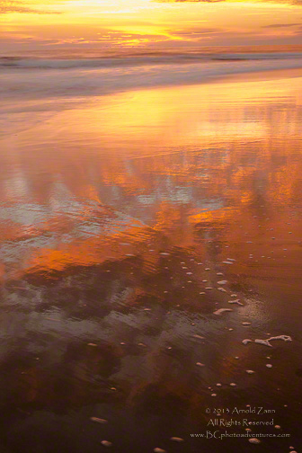
In this one, Arnie is celebrating the reflections and light, but finding patterns in them so that the viewer’s eye wanders around, discovering different elements.
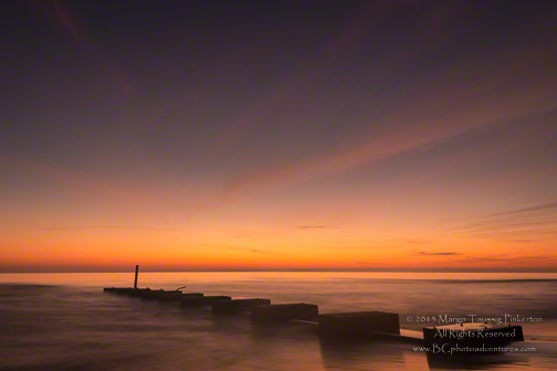
I like simplicity of subject, so that it stands out; I have always been attracted to this cradle and its relationship to the water.
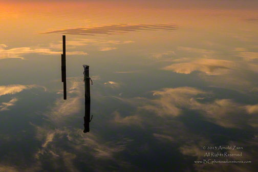
Arnie seems to have a fascination with pilings as in this one with reflections setting them off.
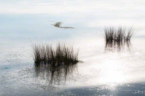
In this photograph, I loved the simple arrangement of the clumps of grasses, at least the arrangement was simple once I did some cropping in camera (not later in Lightroom).
So, you do not need to junk up your photograph to make it eye catching and effective. The old KISS theory works. Less is often more!
For more information on our workshops, go to Barefoot Contessa Photo Adventures.
If you enjoy our blog(s) …
Please SUBSCRIBE. It’s easy to do by clicking on the appropriate link at the top of the right column.
Comments on the blog are always encouraged and welcome.
We also hope you will LIKE this and SHARE this blog with those interested in photography by clicking on the buttons below. We also hope you will check out these links:
Arnie/Margo— I like the third one you posted. It almost feels like you’re viewing earth from outer space. Very ethereal. And, yes, less is more!
Eli Vega, Colorado/USA
Eli,
We like to interpret a scene rather than record it. Arnie’s image is a perfect example. Glad you liked it, and thank you for commenting!
Take care,
TBC
Arnie and Margo, I am flying home after our fabulous workshop in Moab, Utah. I especially love the last two photographs in this blog. Of course this week there wasn’t a lot of water out in the desert for us to capture, but I too love the simple reflections of things like pilings in lakes and oceans. But also the whispy “ghosts” in Arnies photograph are beautiful. And I adore the patterns of light and nature in Margo’s capture of the grass. Looking forward to seeing you both again and thank you so much for all your help.
Andy,
It was a real pleasure getting to know you and to work with you and to hear your ever-so-thoughtful critiques. We look forward to seeing you again.
Meanwhile, thank you for all your comments here. It is lovely to not write in a vacuum!
Take care, and BTW, we are still laughing over some of your great quips!
TBC