Revised again December 27, 2014, based on some questions and comments. Also check the comments for additional information.
…or What settings should I use? …
A recent Facebook discussion made me realize that there is a lot of misinformation and confusion out there regarding outputting your photographs. This is not a one-size-fits-all process, so this blog is intended to be an overview with some guidelines, no more. There is plenty of in-depth information on the Internet, such as at The Luminous Landscape site.
Let’s start with the Web and e-Mail. You will need to make sure you have a proper copyright notice on all your images. I am continually amazed at even long-time professional photographers who do not have a legal copyright notice. For a discussion on that, please read © Is for Copyright. In this day of what’s mine is mine, and by the way, what’s yours is mine, too, many of us do not want to make it easy for people to steal our images. Personally, the idea of someone else making money off a photograph I have made is offensive and to me, unethical.
One way to help combat this is to lower the quality of images posted on the web. Arnie and I then add a watermark to let people know we own all rights to our respective photographs. Can someone remove the watermark? Yes, but does it put people on notice that the photographs are ours? Yes again. Further, it slows them down a bit. We take protection a step further and add a digitally-impregnated watermark done through Digimarc.
For sharing images by e-mail, it is not a kindness to clog someone’s inbox with a humongous file. Unless you know they are going to print out your image, treat it as a web-based one.
For print, we do not watermark our images at all. Instead, we sign our prints in the white space just below the image and again on the mat above. That way, if our print is ever reframed/rematted by an owner, our information remains with the image.
From there?
Pixels
The web can only register a limited 72 pixels per inch (ppi). That means, there are only 5,184 pixels in each square inch. Sound like a lot? Not really, when you figure that printing out a 4″ x 6″ photo at a modest 240 ppi (pixels per inch) affords over ten times that amount.
I have read in several places that you do not want the output quality for the Web to go over 76. Many people set the quality of their images at 70. I compromise at 75.
The image below has been prepared in this manner and was a 48.4KB file before I added the Digimarc. Processed at 100% quality, it grows to 100KB.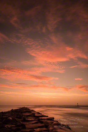
If I were to print it out as a 16″ x 24″ image, I would select 360ppi at 100% quality. Some printing services only offer 300ppi, and that probably works for most situations.
For a 4″ x 6″ or 8″ x 12″, 240ppi suffices quite well.
Please also see Dave Robertson’s additional input below under the Comments section
To show why pixels are so important, I took the image above, grabbed it off the Internet, changed it to a 4″ x 6″ image for printing at 240ppi. See how the image degraded beyond the pale?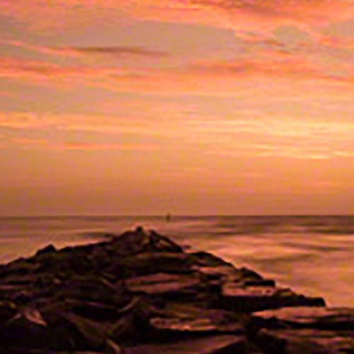 Yippeee!
Color Space
Without going into a whole technical treatise, there are three color spaces that most photographers use: sRGB (that I choose to call screen RGB), Adobe RGB 1998, and ProPhoto RGB. sRBG has the smallest gamut; gamut refers to the range of distinct gradations of color. ProPhoto RGB, the default color space in Lightroom, has the largest. Adobe RGB 1998 falls in between but closer to sRGB than ProPhoto RGB.
A number of modern cameras have a gamut range that is considerably greater than Adobe RGB 1998. This is why we recommend always processing your images in ProPhoto RGB. You take full advantage of what your camera sensor has captured. Then, make a proof copy for the output you intend and check for areas that might be out of gamut for the color space you have chosen — sRGB for web and Adobe RGB 1998 for print. It really is akin to what we recommend in our workshops — always choose the maximum-quality settings in your camera for the highest possible quality. You can always scale down later, but once you choose a lower setting, you can never effectively go back up.
The illustration below give you a good diagram of the differences in gamut amongst the various color spaces.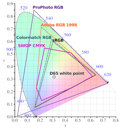
The web can only handle sRGB. If you export an image in the other color spaces, many of the colors — reds and bright yellows, for example — may go out of gamut and because they cannot be rendered on the Internet, they dull or lighten your image. When we convert to sRGB for web use, we are allowing our programs to take into account the differences and make the appropriate color substitutions.
In the example below, you can see how Arnie’s photograph actually looks paler in ProPhoto RGB below the sRGB version. It is subtle, but if you look at the yellows and cliffs, they look a tad washed out in the lower rendition. The sky looks less dramatic, too.

You may remember seeing something called icc profiles. ICC stands for International Color Consortium, a group that seeks to help standardize colors internationally. The organization states as its mission, “The purpose of the ICC is to promote the use and adoption of open, vendor-neutral, cross-platform color management systems.”
 CalibrationThere is no standardization in cameras and the way they interpret color. Neither is there standardization in monitors and the way they render color.
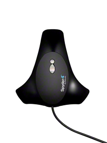
Calibrating your monitor is critical to the success of your presenting your images, whether on the Internet or in a print. We use Spyder4Pro, but ColorMunki is another excellent brand.
Those photos you uploaded to the Web don’t look as they did on your monitor? Hmmm … Dollars to those proverbial donuts that you have not calibrated your monitor!
Adjustments
For both print and web, you may find that you need to lighten/brighten your image by .2 to.25. It will, of course, depend upon the image, and with practice and experience, you will be able to better anticipate what a certain image will need.
Starter Suggestions
Here are some suggestions to get you started, but do not take these as the gospel — I do not have the proper connections for that. And different printing services and different brands of printers use different resolutions, so if you print outside or at home, check before preparing your image.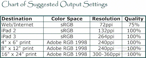
Hopefully, this will help at least some of you, and serve as a reminder to others, as you process your images and output/export them for various uses.
For more information on our workshops, go to Barefoot Contessa Photo Adventures.
If you enjoy our blog(s) …
Please SUBSCRIBE. It’s easy to do by clicking on the appropriate link at the top of the right column.
Comments on the blog are always encouraged and welcome.
We also hope you will LIKE this and SHARE this blog with those interested in photography by clicking on the buttons below. We also hope you will check out these links:
Margo:
Thanks as always for your blog entries. Color management is a big black box for most people so this kind of information is very useful.
I print all of my own work and have taught the concepts of color management and printing locally. That has caused me to investigate a number of areas in order to better understand why we do certain things. I thought it might be useful to expand on three areas you mention, namely printer resolution, calibration of monitors and icc profiles.
Every printer has a native resolution. Most Epson printers (including all of its Stylus Pro printers) have a native resolution of 360 pixels per inch, whereas the native resolution of most Canon and HP printers is 300 pixels per inch. If a different resolution is used than the native resolution, then the printer driver will change the resolution to one of these values, which can give rise to a marginally inferior final print. It is a better practice to change the resolution of the image in a program like Photoshop rather than the printer driver because the algorithm used by Photoshop does a better job.
Another area that is confusing to most people is the difference between calibrating a monitor and profiling a monitor.
Calibration is necessary to bring the monitor to a standard baseline of brightness, color temperature and gamma. It is done by changing the physical controls on the monitor. The standards are generally as follows:
If the monitor is not calibrated properly, then it is virtually impossible to match the look of the monitor image and the final print. The biggest mistake that people make is having the brightness of their monitor set too high. When that is done, invariably complaints are heard that their prints are too dark. That is because the monitor has not been set to the proper brightness (i.e., the brightness is too high).
Profiling is done with software. It cannot be achieved by changing the physical controls on the monitor. The purpose of profiling is to have the monitor properly represent colors. This is done with products such as the ones you mentioned in the blog. Standard colors are displayed on the monitor one at a time and the instrument measures them against these standards. All of these measurements are combined to create an ICC profile specific to that monitor. Then, when we export images from our computer to a printer, the printer knows what the proper colors should be and applies a second profile to the print based upon the make of printer, the inks being used by the printer and the specific paper on which the print is being made.
It all sounds somewhat complicated, but the bottom line is that proper calibration of a monitor will prevent the final prints from appearing too dark and proper profiles will make certain that the colors you see on your monitor match the colors that you see in the print.
For those who want to read more about the subject, I recommend an article by Andrew Rodney (a recognized expert on color management and a great guy to boot) found at http://www.luminous-landscape.com/tutorials/why_are_my_prints_too_dark.shtml. Another great source of understandable information about color management is Cambridge in Colour (www.cambridgeincolor.com/tutorials/color-management1.htm).
I hope this is useful to your readers.
Dave,
Thanks, as always, for your input and addition information and resources. It is good that you reinforce how critical it is to calibrate your monitor.
I would add, in addition to your warning against too-bright monitors, that people need to turn off any ambient-light feature they may have on their monitors. For others who may be reading these comments, this feature allows the monitor to automatically adjust depending upon the ambient light.
I, too, love the Cambridge in Colour website. I came across them years ago and found them to be an excellent resource. I thought I had put it into the blog, but you have done so, so thank you again.
Take care,
TBC
Once again, a clear and concise explanation that is extremely helpful.Thanks, Margo!
Fran,
You are very welcome. It was hard to try and extract the critical meat while trying to keep it relatively simple!
Thanks for writing, and …
Take care,
TBC
Thank you about the post!
צלם אירועים,צלם לברית
Stas,
I am glad you found it interesting. One never knows how it will translate into another language.
Take care,
TBC
Very informative post, Margo. You’ve offered some useful and concise strategies. I enjoyed your Kiawah workshop and often think of you and Arnie when I am shooting sunrises. Hope all is well.
Jane,
I tried to keep it simple, so I am glad you found it informative.
Kiawah was fun, and there was a good group there. Nice to hear from yet another person from that mini workshop.
Take care, and thanks for writing,
TBC