I was delighted to be interviewed by Scott Sheppard on nik Software Radio/TV. It’s always an honor to take part in a program that celebrates different aspects of photography, and Scott is an easy host with a delightful sense of humor. It was fun to reminisce, to talk about my early start with a camera, and share my passion for and approach to photography. Scott even asked about Arnie’s and my philosophy in our workshops.
That interview is now published on nik Radio, but you will have to look for the 10/20/11 date, as it is not obvious where to find the name of the person being interviewed.
When nik first came out with their software, I was hooked. I don’t promote programs and plug-ins per se, but if we find a program that makes our lives easier, I’m not adverse to sharing. After all, we get no kick-backs!
So, where is this taking me this time? I got my first camera, a Brownie Hawkeye, at age eight, and I photographed in black and white. Gradually, I took to color, but I always admired black-and-white photography.
Edward Curtis was an early idol. I loved his sepia tones and elegant composition. Henri Cartier-Bresson was my next discovery. My father and grandmother lived in Paris for a spell, so I was exposed to this great photographer’s work at an early age. His depictions of life in Paris are arresting to this day. I even got to photograph with him many years ago, but that’s another story in another blog.
 After that, there was Richard Avedon, whose work regularly appeared in the fashion magazines my chic mother loved. Later, the of work J. Walker Evans, Margaret Bourke-White, Eugene Atget, and John Sexton caught my eye.
Of course, there have been many others too numerous to mention, but these people inspired me, even when I was mostly shooting color. The tonality of their images was always magnificent and set a bar for me in my color photography. Even some of my images that are almost monochromatic in color work, because there is a good range of lights to darks in them.
When we first got into digital photography, the learning curve was quite steep, so we mostly stuck to color. As the programs got more sophisticated, and programs like SilverEfex Pro came along, however, there was no longer an excuse not to try my hand at it again.
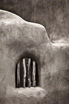
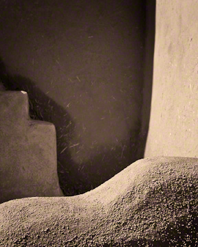
Many of you have already have seen these first three images in color in two recent blogs, Scouting Santa Fé 2011, Adobe Shapes and Scouting Santa Fé 2011, Patterns & Textures. You will find, however, that they have a different feel when rendered in black and white.
The top one I love in both color and black and white. The adobe colors in the late-afternoon light become saturated and stand out. I think, however, that there is an elegance to the black-and-white conversion. I added a bit of silver tone, along with a few other adjustments to keep it from being too gray-scale. I like the subtle warmth that it now has.
The second one above was really all about shape and form, light and shadow when I made it. In sepia, there is no color competing with the essence of the photograph, and the sepia adds to the feeling of age this building has.
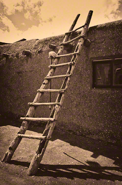 The one to the left, I much prefer in black and white. One of the reasons Arnie said he did not shoot this scene is that the mop was hanging on the old ladder.
For me, it was the juxtaposition of the semi-modern mop on the ladder whose style of construction goes back centuries that caught my eye. The color made the red in the handle stand out, whereas in this rendition, the mop is there, yes, but it is subtle.
I also like the way I was able to make the ladder really pop against the adobe walls. In color, it did not do that to nearly the same degree. Also, in sepia tones, the image gave me the feel of an Edward Curtis classic I wanted.
I started with the Southwest, as the shapes often beg to be rendered in black and white, but there are a few other images I’d like to share.
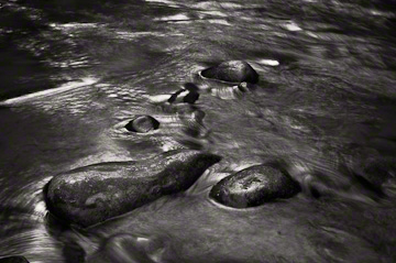 This river scene had subtle color in it. Oranges, hints of blue, plus the dark, somber rocks. It makes a very compelling photograph and was not an obvious candidate for black and white, at least to my eye. Something about the shapes, however, kept calling to me.
This one took a lot more work. I started over in nik, did a number of modifications, then spent a lot of time back in Lightroom burning and dodging, fiddling with the tonality, bringing out the detail I wanted where I wanted it, until I was finally satisfied. Where the color image was serene, I wanted this to have an abstract, metallic look.
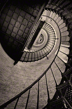 As a long-time sailor, lighthouses have always attracted me. I can’t tell you how many times I’ve seen their welcome beacon through pea-soup fog, or at night by a challenging passage into harbor, or in the distance, telling me I am still on course (long before the days of GPS and Loran). No wonder that I like to photograph them, but I am always looking for a different view.
This one has been on our website, and in color, it is interesting, but here, I wanted to give a sense of its history, the bare-bones nature of its structure, its elegance.
I started off with a sepia tone, then after tweaking it some more, pulled back on the saturation in Lightroom to lessen the tone a bit. Doing that lent an added simplicity to the composition that was not there in color.
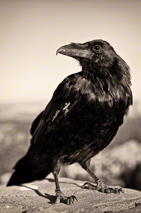 This last one is a bit of whimsy for me. One of the earliest stories I remember my grandmother reading to us, aside from the Jungle Books, was Edgar Allen Poe’s The Raven. I have always loved these intelligent, curious, and humorous creatures. They mesmerize me, and don’t laugh, I have had many a long conversation with ravens here and there as some of our alumni can verify.
Arnie knows of my life-long-thus-far attraction to these birds and several years ago, gave me a wonderful raven statue that sits on my desk, leaning forward, and quothing, “Nevermore …”
Ravens have been around a long time, and I wanted to give an old-world feel to this one, an old friend with whom I’ve had several conversations over the years. I look forward to seeing him again next year.
Arnie and I feel presets are only a beginning, whether they are Margo’s Tweaks that our participants love, or ones in Lightroom or SilverEfex Pro. Yes, I started out with a preset for all of these, including Margo’s Tweaks modified to one degree or another. Taking it over into SilverEfex Pro gave me more preset choices, but none of them worked for me without further adjustments, both in the nik program and back in Lightroom. You’ll notice that the color is different in each of these photographs. No standards for me!
So, the next time you go out photographing, look for a range of values for your images. If you do not see tone, you are not alone. My mother, who was a very accomplished and collected painter needed one of those Value Finders to make sure she was getting a dynamic range of lights to darks in her paintings. As a photographer, you can use it in the field to help determine if a scene has enough tonality to work in a photograph.
Most imaging programs have some sort of gray-scale converter. The better programs come with presets and the ability to work with plug-ins that have presets. Experiment. Use the free trials offered by many software companies and find out what works for you.
If you enjoy our blog(s) …
Please sign up for a subscription. It is easy to do by clicking on the appropriate link in the right column at the top.
We always love to get comments.
We also hope you will LIKE this and SHARE this blog with those interested in photography by clicking on the buttons below. We also hope you will check out these links:
Beautiful work Margo.
I love the banner photo of the lightening and storm.
Black & White is a lost art in today’s day and age of vibrant color.
Thanks Margo.
Pablo,
Thank you. If you go to certain galleries around the country, I’m happy to say black and white is alive and well, although I must agree with you that most people find it is easier to see and shoot in color. And by the way, I also love color.
Thanks for writing!
TBC
Great to see B&W again! As usual, Margo, your images are wonderful and well-described.
I started out with a Maxwell House pinhole camera I made at the age of ten – a Cub Scout project. My dad was an industrial photographer and taught me how to develop B&W. Whenever I have Italian dressing I think of photo stop. Sort of low-tech memories when you think of what we work with now, eh?
Ronn,
What a wonderful memory you have shared with us. While later used, your pinhole camera made my Brownie Hawkeye look high tech! And as you say, what a far cry from what we use today!
And thank you for the lovely compliment!
Take care,
TBC
Margo:
Great reminder of the power of black and white. I teach digital black and white conversion here in Northern California and had occasion to investigate the techniques available to photographers, coming up with two in Lightroom (desaturate or B&W mix) and almost a dozen in Photoshop. What I found is that Lightroom and Nik Silver Efex Pro 2 can be combined to produce luscious black and white images in very short order. Nice to have great tools. Dave
Dave,
Those great tools, combined with the initial eye, can produce wonderful images, to wit some of the photographers I mentioned in my blog.
Meanwhile, I certainly agree with you on the great combination of Lr3.x and nik’s SEP. I find I tweak first in color, take the image over into nik SilverEfex Pro, then return to Lightroom for final adjustments.
Thanks for checking in.
Take care,
TBC