Same Place — Different View
Last fall, we had a fun group of participants, some new, some alumni, all of whom ended the workshop as stronger photographers.
The Students’ Gallery for Lighthouses of the Outer Banks has been posted, so you can check that out, too.
As those of you know who follow this blog, we give out assignments designed to challenge, and in some cases, frustrate. After all, we want to push our participants beyond their comfort levels.
Colors are always fun, but how does one make something interesting out of plastic desk furniture?
Lamar worked with the geometrics of the bases of the chairs.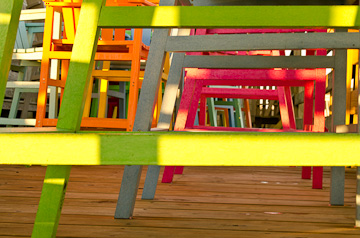
Rebecca took a similar approach, but hers looks totally different.
Ron went for straight, simple graphics for his rendition.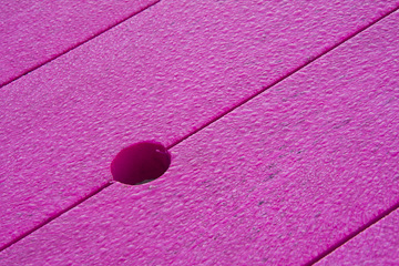
Struck by the row of colors, Nancy gave it a twist, literally.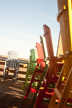
At another location, there is a pipe coming out of the side of one of the buildings. It is far from beautiful, so the challenge is to make something interesting out of it.
David B. turned it into something textured and funky.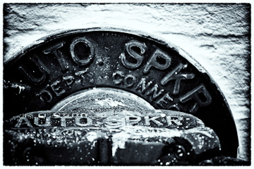
Using a bit of whimsy, David K. hung his yellow rain jacket on it..jpg)
Ann loves black and white and treated it in sepia tones.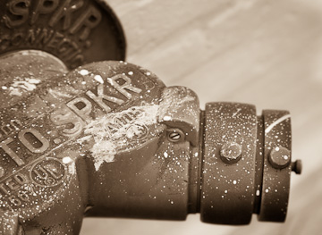
Taking a different tack, Liz added some yellow flowers.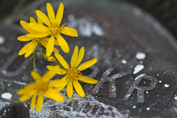
In contrast, Dean went for a symetrical treatment.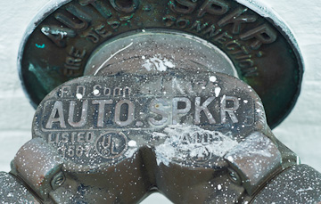
Yes, two sets of Same Place – Different View. And how different they all are.
Once again, don’t settle for the first view you see. These are reminders to us all that there are many ways to approach a subject. So, go out, and make whatever that subject is yours.
Meanwhile, check out our calendar. Some of our workshops are nearly full. Come join in the fun.
If you enjoy our blog(s) …
Please SUBSCRIBE. It’s easy to do by clicking on the appropriate link at the top of the right column.
Comments on the blog are always encouraged and welcome.
We also hope you will LIKE this and SHARE this blog with those interested in photography by clicking on the buttons below. We also hope you will check out these links: